Saturday, June 20, 2009

10+ Best Photoshop Brushes


Metal Brushes

Fantsy Butterfly


Floara Astral


Crack & Cut Brush

Cs4 Brushes


Line Brushes


Smudge Brushes


Industrial Brushes


Tribal Tatto brushes


Floral Brushes

if you like this post then leave some comments so i can come up with some more photoshop Brushes.

Friday, June 19, 2009

Which is The Best Screen Size For Website?


Your pages should work at any resolution, from 800x600 to 1280x1024 and beyond.

  • Optimize for 1024x768, which is currently the most widely used screen size. Of course, the general guideline is to optimize for your target audience's most common resolution, so the size will change in the future. It might even be a different size now, if, say, you're designing an intranet for a company that gives all employees big monitors.
  • Do not design solely for a specific monitor size because screen sizes vary among users. Window size variability is even greater, since users don't always maximize their browsers (especially if they have large screens).
  • Use a liquid layout that stretches to the current user's window size (that is, avoid frozen layouts that are always the same size).
Optimizing for 1024x768 Screen Sizes

When we say "optimize" we mean that your page should look and work the best at the most common size. It should still look good and work well at other sizes, which is why I recommend a liquid layout using percentage widths to control layout. But it should be its best at 1024x768.

The three main criteria in optimizing a page layout for a certain screen size are:

  • Web Page Initial visibility: Is all key information visible above the fold so users can see it without scrolling? This is a tradeoff between how many items are shown vs. how much detail is displayed for each item.
  • Web Page Readability: How easy is it to read the text in various columns, given their allocated width?
  • Web Page Aesthetics: How good does your page look when the elements are at the proper size and location for this screen size? Do all the elements line up correctly -- that is, are captions immediately next to the photos, etc.?
You should also consider all three criteria at the full range of sizes, continuously resizing the browser window from 800x600 to 1280x1024. Your page should score high on all criteria throughout the entire resolution range.

Your page should also work at even smaller and bigger sizes, though such extremes are less important. Fewer than half a percent of users still have 640x480. Although such users should certainly be able to access your site, giving them a less-than-great design is an acceptable compromise.

As the first criterion implies, scrolling is always a key consideration. Users generally don't like to scroll. So, when you design, you should consider how much users can see if they scroll only a screen full or two. Any more than five screen full's should be an indication to you that there is two much copy on the page.

Both scrolling and initial visibility obviously depend on screen size: Bigger screens show more content above the fold and require less scrolling. This is where you have to optimize for 1024x768: present your most compelling material above the fold at this resolution (while ensuring that the absolutely critical information remains visible at 800x600).

So, what about tiny screens, such as those found on mobile devices? A liquid design should scale all the way down to a phone, but don't assume that this is how you should deliver your company's mobile user experience. Mobile environments are special; to optimize for them, you must design a separate service that provides fewer features, is written even more concisely, and is more context aware.

Remember to build a website to the size you expect most visitors to be using - some research can help you with this, but always aim to please the visitors you seem to attract!

Monday, June 15, 2009

Panoramic Stitching, Stacking and Blending in CS4


Sunday, June 7, 2009

Simple 5 Steps to Draw Jerry from Tom & Jerry


My Last post was how to draw tom and you know Tom is incomplete without Jerry so Today you will learn how to draw Jerry from the animated cartoon series Tom and Jerry. Follow some simple steps and Enjoy. I am using Corel Draw 14 you can use even Adobe illustrator, Freehand or any other Vector based Tool.


Step 1.
Start this first step by drawing the guidelines and shapes of Jerry. You will first make a big circle for his head and then add his facial guidelines in. You will then make a dash of a line for his ear and then draw a semi oval shape for his belly. From the belly shape you will attach the guidelines for his limbs, feet and hands.

Step 2.
Now in this step you will start shaping out his face which includes his forehead and oval eyes. You will then shape out the arms and then his little legs. As you seen in the finished picture you will start drawing out the block of cheese he is holding in his hands.

Step 3.
Now that you have made it this far, I'm sure you already know what is next? That is right begin sketching out the face and then draw out the big rounded ear. Give Jerry eyebrows and two pupils. You will then make his cute little cheek and then a nice smile. Draw the rest of the cheese block and then his hand. Add his other arm and then the shape of his left leg. Add some toes and move on.


Step 4.
Since this is your last step I think you know what you will be doing? Finishing off Jerry that's right. Start by Drawing the other ear shape and then add his pieces of hair on top of his head. You will next detail the inside of the right ear as shown. Detail his eyebrow and then add some whiskers. Make some holes in the mouse cheese and then give him a nice mousey tail. after you are don you can then erase all the guidelines and shapes that you drew in step one.

Step 5.
When you are done you will end up with something like the Jerry you see here. Color in his eyes and that is it color him in. That is it you are done. You have just finished this tutorial on how to draw Jerry the mouse from Tom and Jerry. I will be back in a while with some more.

Final Result


Tuesday, June 2, 2009

Simple 6 Steps to Draw Tom from Tom & Jerry


After lots of web design tutorials, Today you will learn how to draw Tom the cat from the animated cartoon series Tom and Jerry. Follow some simple steps and Enjoy. I am using Corel Draw 14 you can use even Adobe illustrator, Freehand or any other Vector based Tool.


Step 1.
In this first step you will start by drawing out the guidelines and shapes. First make a circle for his head and then add the facial guidelines. You will then add the ear shapes along with the big circle shape for his body. You will then add the guidelines for the arms, legs, feet and hands. See easy right?

Step 2.
Now you will start sketching in Tom's face starting with the eye and then make the rounded lining for his nose. What is the next thing you will add to his face? That is right his mouth. Once you finish that you will begin shaping out the arms and back along with the thigh and hands.

Step 3.
What you will do next here is add the eyeballs and then the inner lining of inside of his mouth. After you do that start shaping out Toms head and make sure you add the hair pieces. Start shaping out his arms and hands along with his legs and feet. Make a few nubs for his fingers as well.

Step 4.
Detail the inside of his ear by drawing the inside line. Add a few pieces of hair in his ears and then add his eyebrows which happen to be a bit bushy. Give Tom his cute button nose and then his right cheek. Add a tongue and then detail his chest by making his belly and then add his toes. You will end this step by adding his fingers and wrist hair. How hard do you think this tutorial is? Not hard at all huh.

Step 5.
Yay guess what this is? You r last drawing step. You will end this step by first erasing all the guidelines and shapes that you drew in step one. Then color in his nose and finish drawing out the match and firecracker along with the fingers.

Step 6.
When you are done this is what your Tom should come out looking like. Now that you are done you can color the drawing. You have just finished this tutorial on how to draw Tom the cat from Tom and Jerry.
hope you like this tutorials if yes then leave some comments.

Thursday, May 28, 2009

You can not delete anything on Internet


It's always fun to write about research that you can actually try out for yourself.

Try this: Take a photo and upload it to Facebook, then after a day or so, note what the URL to the picture is (the actual photo, not the page on which the photo resides), and then delete it. Come back a month later and see if the link works. Chances are: It will.

Facebook isn't alone here. Researchers at Cambridge University (so you know this is legit, people!) have found that nearly half of the social networking sites don't immediately delete pictures when a user requests they be removed. In general, photo-centric websites like Flickr were found to be better at quickly removing deleted photos upon request.

Why do "deleted" photos stick around so long? The problem relates to the way data is stored on large websites: While your personal computer only keeps one copy of a file, large-scale services like Facebook rely on what are called content delivery networks to manage data and distribution. It's a complex system wherein data is copied to multiple intermediate devices, usually to speed up access to files when millions of people are trying to access the service simultaneously. (Yahoo! Tech is served by dozens of servers, for example.) But because changes aren't reflected across the CDN immediately, ghost copies of files tend to linger for days or weeks.

In the case of Facebook, the company says data may hang around until the URL in question is reused, which is usually "after a short period of time." Though obviously that time can vary considerably.

Of course, once a photo escapes from the walled garden of a social network like Facebook, the chances of deleting it permanently fall even further. Google's caching system is remarkably efficient at archiving copies of web content, long after it's removed from the web. Anyone who's ever used Google Image Search can likely tell you a story about clicking on a thumbnail image, only to find that the image has been deleted from the website in question -- yet the thumbnail remains on Google for months. And then there are services like the Wayback Machine, which copy entire websites for posterity, archiving data and pictures forever.

The lesson: Those drunken party photos you don't want people to see? Simply don't upload them to the web, ever, because trying to delete them after you sober up is a tough proposition.

Photoshop: Advertising Banner Design For website


In this tutorial I’ll teach you how to make a nice, sleek and professional advertisement banner. It’s really quite easy, but you will need previous Photoshop knowledge to successfully complete this tutorial.


Step 1:

First step is to make the document in Photoshop. File > New, use a size of 468 x 60 pixels.
Now fill the background with a nice orange gradient, the colors I used for my gradient were #e14d0f and #4d1805.

Note that you’ll need to use the Gradient Tool to fill the background with the gradient. You can find the gradient tool on the same button as the fill bucket tool.

Step 2:

Next thing to do is create a new layer. Now using the Polygonal Lasso Tool, make a selection like mine in the left section of your document.

Be sure you’re on a new layer, then fill your selection with a nice, bright gradient, the colors for the gradient I used were #0084e6 and #003967.

Right-click your layer and go into the Blending Options, apply the following layer styles for your blue gradient layer:
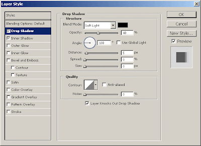
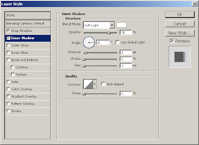

After you applied those two layer styles, your thing should now look like this:

Lastly for this step, add a nice glossy highlight to your blue gradient layer, you can do this by following these few simple steps:

1. Start by making a new layer, now select the blue gradient layer by holding ctrl and clicking the layer’s thumbnail.
2. Using the Gradient Tool, drag a white gradient inside of your selection.
3. After making your gradient, nudge your selection down 30 pixels (hold shift and press the down arrow key three times) then press delete.
4. Change the layer mode for your shine layer to Soft Light, and lower the opacity to about 30-55%.

Step 3:

How about adding some nice details?
Start by using the pen tool to make a nice, smooth path in the background on the right. After you made a nice selection, do a little soft brushing inside then change the layer mode to Soft Light and lower the opacity if needed.


Step 4:

Write out your description text in the left section using the Horizontal Type Tool, write your text out in white (#FFFFFF.)


The font used above is called RockWell, you can find it for free on DaFont.
After writing out your text, apply the following layer styles:


That will have made your text stand out a bit more nicely.

Step 5:

Next thing to do is add in some thumbnails or something else on the right side, or you could use some descriptive text. I added in 3 thumbnails from tutorials from PhotoshopSpot, then applied this Inner Glow and this Stroke.


You should have something like this:

Step 6:

Lastly you’ll want to add in something that will attract the users’ eye, so I added in a little star badge with the text: “GO!”

Firstly I made the star badge by using the Polygon Tool, then I added in the following layer styles:
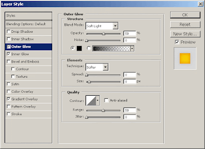
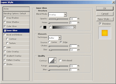
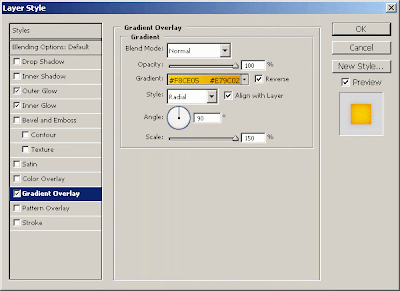

And you should have a badge that looks like this:

Lastly I added in the text for the badge, I then applied the following layer styles:
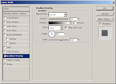
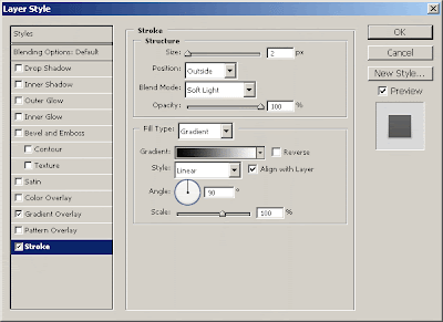

And now you should have text that looks like this:

Step 7:

Last thing you will want to do is add in the border, I guess it depends what sort of website it will be going on to choose the color. If it’s going on a black website, you should use white as the border, if it’s going on a white website, you should use a black border.


Webdoor. Copyright 2009 All Rights Reserved Revolution Two Church theme by Brian Gardner Blog Skins